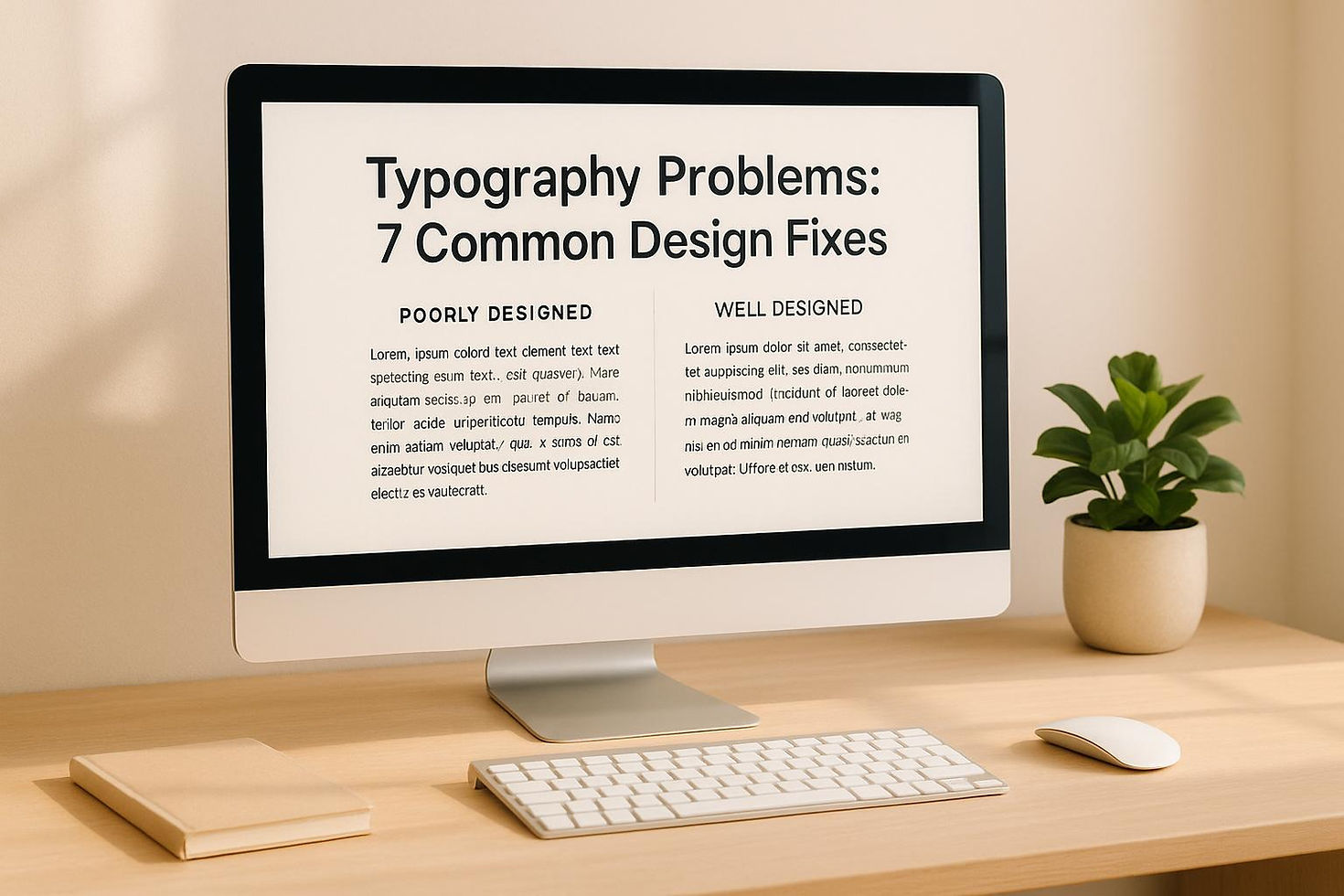
Typography Problems: 7 Common Design Fixes
- Aug 18, 2025
- 12 min read
Updated: Sep 1, 2025
Typography mistakes can ruin user experience - but fixing them is simple. Here are seven common issues and how to solve them:
- Poor readability: Small fonts, weak contrast, decorative fonts in paragraphs, and improper line lengths make content hard to read. Fix this by increasing font size (16px+), using high-contrast colors, choosing sans-serif fonts for body text, and keeping line lengths between 45–75 characters.
- Bad font pairings: Too many fonts or mismatched styles create clutter. Stick to 2–3 fonts, pairing serif with sans-serif or using a single font family with varied weights.
- Weak text hierarchy: Similar heading sizes and inconsistent font weights confuse readers. Use clear size and weight differences, proper spacing, and subtle visual aids like lines or color changes to guide users.
- Alignment issues: Misaligned text feels chaotic. Use left alignment for body text, center for short elements, and avoid justified text on screens. Stay consistent.
- Spacing problems: Tight or uneven spacing disrupts flow. Adjust line height (1.4–1.6 for body text), paragraph spacing, and margins for clarity.
- Low contrast: Poor color choices harm visibility, especially for users with visual impairments. Follow WCAG standards (contrast ratio of 4.5:1 for normal text) and test combinations with online tools.
- Non-responsive typography: Text that doesn’t scale well across devices frustrates users. Use scalable units like in CSS and test fonts on real devices.
Fix these issues to improve user experience, reduce bounce rates, and ensure accessibility. Simple changes like better font choices, clear hierarchy, and responsive designs can make your content more readable and professional.
Top 5 Common Typography Mistakes and How to Avoid Them - Typography Tips 👌
Fix Poor Text Readability
Struggling to read poorly designed text is a surefire way to drive visitors away. If your content isn’t easy on the eyes, users will leave within seconds. The good news? The common culprits are easy to spot, and the solutions are straightforward.
Spot Readability Problems
Some of the most frequent readability issues include:
- Font size that's too small: Text smaller than 14px can make readers squint or zoom in, especially on mobile devices. This creates unnecessary frustration and disrupts the user experience.
- Weak color contrast: Light gray text on white or white text on light images might look trendy, but it’s tough to read - especially for users with visual impairments or in bright environments.
- Decorative fonts in paragraphs: While script or display fonts can make headlines pop, they’re exhausting to read in long-form content. Using them for body text slows down reading speed and creates fatigue.
- Line length issues: Lines that are too long or too short can disrupt the reading flow. Long lines strain the eyes, while overly short ones create a clunky rhythm.
Apply Readability Solutions
Here’s how to fix these issues and make your content easier to read:
- Increase font size: For body text, use at least 16px on desktop and 18px on mobile. If your audience includes older readers or your site features lots of text, consider going up to 18px–20px across all devices.
- Boost color contrast: Aim for a contrast ratio of 4.5:1 between text and background colors. Dark text on a light background works best for lengthy content, while light text on dark backgrounds can work in smaller sections. Test your color combinations with contrast-checking tools to ensure accessibility.
- Pick the right fonts: Use sans-serif fonts like Arial, Helvetica, or system defaults for body text. These are easy to read on all devices and browsers. Save decorative fonts for headlines or accents where they can stand out without affecting readability.
- Fix line lengths: Keep lines between 45–75 characters for a natural reading flow. On wide screens, use columns or text containers to avoid overly stretched lines. On mobile, ensure there’s enough margin so text doesn’t hug the screen edges.
- Adjust line spacing: Set line height to 1.4–1.6 times the font size. This spacing strikes the right balance - too tight feels cramped, and too loose disrupts the reading flow.
Create Better Font Combinations
Too many fonts or mismatched pairings can make a website look cluttered and unprofessional. A thoughtful approach to typography ensures your design feels polished and cohesive.
Limit Font Choices
Stick to two or three fonts across your entire site. This limitation encourages deliberate decisions and helps establish a unified visual identity.
- Primary font: Use this for body text and the majority of your content. Opt for something highly readable like Open Sans, Lato, or Roboto.
- Secondary font: This can add personality for headlines and section titles. Consider options like Montserrat, Playfair Display, or Oswald.
- Third font (optional): Reserve this for specific accents, such as quotes, buttons, or branding elements.
For a timeless look, pair a serif font with a sans-serif font. Alternatively, mix fonts with contrasting weights or styles for added interest. For example, a bold sans-serif headline paired with a clean, simple body font strikes a balance between flair and readability.
Avoid using fonts that are too similar - they’ll clash instead of complementing each other. For instance, two sans-serif fonts with nearly identical weights can look like a mistake. Instead, consider using a single font family with multiple weights (like light, bold, and italic). This approach ensures variety without sacrificing harmony.
Maintain Style Consistency
Once you’ve chosen your fonts, applying them consistently is key to creating a professional and intuitive design.
Define clear typography rules for different text elements, such as headlines, body text, and accents. Before you dive into designing, set up a typography system that outlines styles for H1, H2, and H3 headings, as well as body text, captions, and buttons. Specify font sizes, colors, and spacing for each element, and document these settings to ensure uniformity throughout your site.
Always test your font pairings across various contexts and devices. A combination that looks great in a large hero section might lose its impact in smaller areas like sidebars or footers. Check that your fonts remain legible and visually appealing at different sizes, from 48px headlines to 16px body text.
Lastly, don’t overlook font performance. Every additional font family increases your site’s load time. If you’re using Google Fonts, only load the weights and styles you need. For example, loading Regular, Bold, and Italic is far more efficient than loading multiple unused styles like Light, Medium, and Black. This small optimization can make a big difference in your site’s speed.
Build Clear Text Hierarchy
A clear text hierarchy ensures that users can quickly scan and locate essential information. By combining improved readability with thoughtful font choices, a well-structured hierarchy makes navigating content effortless.
Common Hierarchy Problems
Many websites struggle with poor visual hierarchy, which can confuse readers and make navigation frustrating. A frequent issue is when headings are too similar in size, making it hard to differentiate between main topics and subtopics at a glance.
Inconsistent font weights add to the problem. For instance, using bold for some headings while opting for lighter styles for others can disrupt the natural flow of importance, leaving readers unsure about the content’s structure.
Another common challenge is tight spacing between headings and their related text. This lack of breathing room makes it harder for readers to distinguish one section from another.
Create Effective Hierarchy
To build a strong hierarchy, start by addressing these issues and creating a clear structure that guides readers seamlessly through your content.
- Differentiate Heading Levels: Make sure primary headings stand out distinctly from secondary and tertiary ones. Use variations in size and style to establish clear visual cues.
- Keep Font Sizes and Weights Consistent: Use a logical progression. For example, reserve bold or heavier fonts for the most important headings, while subtler styles can indicate less critical sections. This creates a natural flow from broad topics to finer details.
- Improve Spacing: Adjust the spacing around headings to group related content effectively. Adding extra space above headings can clearly signal the start of a new section, making the layout easier to follow.
- Use Color and Contrast Wisely: Primary headings should have a strong, dark tone, while subheadings can use lighter shades to indicate their relationship to the main topic. This approach enhances clarity without overwhelming the design.
- Add Subtle Visual Aids: Borders, background accents, or even subtle lines can help separate sections visually, adding structure without creating clutter.
Fix Alignment and Spacing Issues
Misaligned text and inconsistent spacing can make a website feel chaotic and unprofessional, throwing off the reading experience. Let’s break down how to get it right.
Align Text Properly
Text alignment plays a huge role in how easily visitors can navigate your content. Here’s how to use it effectively:
- Left alignment is ideal for most body text. It creates a natural reading flow, aligning with how English is typically read - from left to right.
- Center alignment works best for short text elements like headings, quotes, or call-to-action buttons. Avoid using it for longer paragraphs, as it creates a jagged left edge, making it harder to follow the text.
- Right alignment has limited use but can work for specific elements like dates, prices, or navigation links. Never use it for body text - it’s just too hard to read.
- Justified text might look polished in print, but on screens, it often leads to awkward spacing that disrupts readability.
The key? Stay consistent. If your headings are center-aligned, make sure all headings follow suit. If your body text is left-aligned, stick with it across the entire site. Consistency creates a sense of order.
Set Proper Line Height and Spacing
Once your alignment is sorted, focus on spacing to improve readability further.
- Line height (or leading) determines the vertical space between lines. For body text, aim for a line height of 1.4 to 1.6 times the font size. For instance, if your font size is 16px, set the line height between 22px and 26px.
- Headings can use tighter line heights, around 1.1 to 1.3 times the font size. Since larger text takes up more space, it doesn’t need as much breathing room. On the other hand, captions and footnotes benefit from a bit more spacing to improve clarity.
- Paragraph spacing helps separate ideas. Add space equal to about one line height between paragraphs to give readers a visual pause. Avoid double line breaks or overly large gaps, as they can make the content feel disjointed.
- Section spacing should be more pronounced than paragraph spacing. Use spacing that’s 1.5 to 2 times your paragraph spacing to signal a shift in content.
Keep in mind how different text elements relate to each other. Headings should sit closer to the content they introduce rather than the section above. This grouping helps readers easily identify which text belongs together.
Finally, don’t forget about margins and padding. These ensure your text doesn’t collide with other design elements, especially on mobile screens where space is limited. Thoughtful spacing combined with a clear text hierarchy creates a polished, reader-friendly design.
Improve Text Contrast for Accessibility
Ensuring your text is easy to read isn’t just about aesthetics - it’s about making your content accessible to everyone, including individuals with visual impairments or those viewing your site in bright light.
Learn Contrast Requirements
The Web Content Accessibility Guidelines (WCAG) outline specific contrast standards to improve readability. For normal-sized text (smaller than 18pt or 14pt bold), the contrast ratio must be at least 4.5:1 to meet WCAG AA standards. Larger text - defined as 18pt or larger (around 24px) or 14pt bold (around 18.66px) - requires a minimum contrast of 3:1. For the stricter WCAG AAA standards, the ratios increase to 7:1 for normal text and 4.5:1 for large text [1].
Text Size | WCAG AA Requirement | WCAG AAA Requirement |
Normal text (under 18pt or 14pt bold) | 4.5:1 | 7:1 |
Large text (18pt+ regular or 14pt+ bold) | 3:1 | 4.5:1 |
These rules apply to body text, form elements, buttons, and other user interface components. However, decorative elements and logos are excluded from these requirements.
Adjust Colors for Better Contrast
To ensure your design meets these standards, use online contrast-checking tools. Many tools include an eyedropper feature, allowing you to test color combinations directly from your design.
For the best results, stick to high-contrast combinations like dark text on light backgrounds or light text on dark backgrounds. For example, black text on white is a classic choice, but other pairings, like deep navy on light gray or white on dark charcoal, can also work well while maintaining visual appeal.
It’s important to avoid low-contrast combinations, such as light gray on white or yellow on white, as these can strain the eyes. Also, steer clear of red-green pairings, which can be problematic for individuals with color blindness.
To save time, consider creating a library of pre-approved color palettes that meet contrast requirements. Incorporate contrast checks into your workflow to ensure every piece of content aligns with accessibility standards before it’s published.
Make Typography Work on All Devices
Responsive typography ensures that text stays readable and well-spaced, no matter the device.
Set Up Scalable Fonts
Creating fluid typography is essential for text that adjusts seamlessly across screen sizes. This can be achieved by using scalable units like the CSS function, which adjusts font sizes dynamically based on the viewport width.
For instance, you can set your main heading to . This ensures the font size won't drop below 24px on smaller screens or exceed 48px on larger displays, while scaling proportionally in between. Similarly, for body text, use to maintain readability on mobile devices. Keep in mind that text smaller than 16px on mobile often forces users to zoom in, which can lead to a frustrating experience.
Line height also needs to adapt to different screen sizes. On mobile devices, tighter line spacing (around 1.4 to 1.5) prevents text from feeling too spaced out on narrow screens. On desktops, slightly looser spacing (1.5 to 1.6) improves readability for wider layouts.
To maintain consistency, consider creating typography scales tailored to different breakpoints. For example:
- Mobile scale: 16px, 20px, 24px, 32px for headings
- Desktop scale: 18px, 24px, 32px, 48px for headings
This structured approach ensures proportional text sizes across all devices. Once you've set up scalable fonts, test their performance to ensure they look great everywhere.
Test Text Across Screen Sizes
Testing your typography on real devices is just as important as designing it. While browser simulations are useful, they don't always capture the nuances of actual displays. For instance, pixel density and screen quality on devices like iPhones or tablets can significantly affect how typography appears.
Focus on testing at critical breakpoints, such as around 768px, to catch any abrupt layout issues. Also, ensure touch targets are at least 44px in size, which is crucial for accessible interaction. This means mobile typography should include enough padding and spacing around interactive elements.
Lastly, check your text in different orientations. A design that looks perfect in portrait mode can become unreadable or poorly spaced when the device is rotated to landscape. Overlooking this scenario can lead to inconsistent user experiences, so make sure your typography adapts to both orientations seamlessly.
Conclusion
Typography issues can significantly impact your website's performance, but tackling these seven fixes can make a noticeable difference in both usability and visual appeal. From enhancing text readability and crafting better font pairings to establishing a clear hierarchy and ensuring accessibility, each adjustment improves how users interact with your site.
Apply these fixes across your entire site. Poor typography can lead to higher bounce rates, lower conversions, and accessibility challenges. By focusing on elements like contrast ratios, responsive text scaling, and proper spacing, you’ll create a more inclusive and polished online presence. These changes also lay the groundwork for refining your design even further with expert guidance.
To help you take your skills to the next level, NEWFORM provides a wealth of resources designed to boost your proficiency in Wix Studio. They offer live, expert-led workshops with industry professionals and a thriving Discord community of over 12,000 members who provide ongoing support and feedback. As web designer Nina Goulet shares, [2]. Their monthly design challenges allow you to practice typography techniques, receive constructive feedback, and even compete for prizes. Plus, their resource library is packed with detailed tutorials like “Creating Dynamic Sliders with Wix Studio” and “How to Create Animation from Figma in Wix Studio,” along with ready-to-use templates and UI components that showcase proper typography practices [3].
"Join live sessions led by industry experts and top designers to master Wix Studio. Learn cutting-edge techniques, improve your workflow, and stay ahead in web design." - NEWFORM [2]
Whether you’re grappling with font combinations, responsive text adjustments, or accessibility standards, NEWFORM’s educational tools and resources equip you to elevate your typography and enhance your web designs.
FAQs
What are some typography tips to make text more accessible for users with visual impairments?
To make typography easier to read for users with visual impairments, prioritize clarity and contrast. Opt for high-contrast color schemes that make text stand out, and stick with sans-serif fonts like Arial, Helvetica, or Verdana - these fonts are simpler and more legible on digital screens.
Keep the font size at a minimum of 16 pixels (or 12 points) for body text, and ensure users have the option to adjust the text size if necessary. Steer clear of overly decorative fonts, and use proper spacing between lines and letters to make the content more readable. These adjustments may seem minor, but they can greatly improve the reading experience for individuals with visual impairments.
What are the best practices for making typography work well on all screen sizes?
To make typography look great on any device, focus on fluid type scales that adjust naturally to different screen sizes. Instead of sticking to fixed pixel values, use relative units like or for better flexibility. A good rule of thumb is to set a base font size of at least 16px to keep text readable, especially on smaller screens.
Also, pay attention to line height to improve legibility, establish a clear typographic hierarchy, and take advantage of CSS tools like Flexbox to create layouts that adapt smoothly. These practices ensure your text remains both attractive and easy to read, no matter the device.
How can I choose and test font pairings to create a polished and cohesive website design?
Creating polished and professional font pairings starts with choosing styles that work well together - like pairing a serif font with a sans-serif. To ensure they look cohesive, focus on fonts with similar x-heights and proportions, which help maintain visual balance. Always test your selected fonts on various screen sizes and devices to confirm they’re easy to read and consistent.
To fine-tune your typography, play around with font weights, sizes, and spacing. This helps establish a clear text hierarchy and creates a balanced design. Evaluate how the fonts interact in practical contexts, such as for headlines, body text, or buttons, and tweak as necessary to achieve a clean, user-friendly look.


Comments