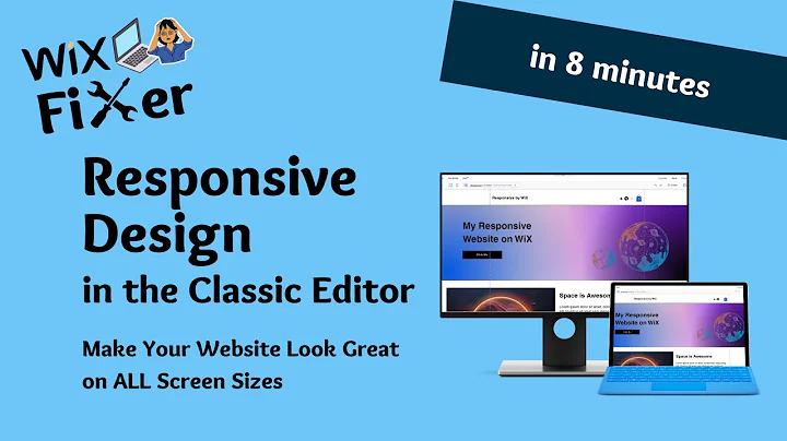
How To Make Your WiX Website Look GREAT on ALL Screen Sizes | WiX Classic Editor | Responsive Design
How To Make Your WiX Website Look GREAT on ALL Screen Sizes | WiX Classic Editor | Responsive Design
Hey there, web wizards! Welcome back to another exciting session here on NewForm, where we're all about helping you master the art of web design. Today, we're diving deep into the world of WiX websites and how to make yours shine on any screen size using the trusty old WiX Classic Editor.
You’ve built your website, it looks amazing on your screen, but... cue dramatic music] it falls apart on smaller devices! Fear not, fellow designer. We're going to tackle this vexing issue head-on and make sure your website dazzles on screens of all shapes and sizes. So grab your coffee, and let's get started! 🌟
WiX Classic Editor: A Brief Overview
Before we jump in, let's touch on why the Classic Editor remains a beloved tool in the arsenal of web designers. It’s user-friendly, packed with features, and offers a straightforward drag-and-drop interface. Perfect for beginners and pros alike. But, as with any tool, understanding its limitations is key to pushing its capabilities to the max.
The Big Screen vs. The Small Screen Dilemma
The issue arises when designs created on wide screens get cut off on smaller ones. You might have the sleekest looking website around, but if half of it is hidden on a viewer's laptop, the experience is, well... lacking.
Picture this: your beautifully crafted header disappears, crucial buttons hide in the corner, and images are cutoff. Not exactly the first impression you’re aiming for, right? Let’s ensure your design doesn’t just survive but thrives across diverse screen sizes.
Step #1: The Zoom Out Trick
First things first – zoom out! This step is vital when working with smaller screens. WiX provides two handy lines in the editor, a boundary of sorts. Anything between these lines will be visible on any screen size. Sounds simple, right? Ensuring your important elements reside within these lines can save you major headaches later on!
Why Zoom Out? It gives you a bird’s eye view, helping you realistically anticipate what your visitors might see on smaller displays. Drag text, images, and buttons to fit snugly within these preset boundaries.
Step #2: Embrace the Power of Strips and Columns
Feeling cramped after squeezing everything between those lines? We hear you. Enter Strips and Columns – your new best friends.
Adding a Strip:
- Click `Add` -> `Strip` from the menu.
- Use an `empty strip` for ultimate flexibility, especially helpful if you're working with specific backgrounds.
Splitting Into Columns:
- Select the Strip -> Choose `Layout`.
- Add columns to distribute your elements beautifully across screens.
Each column now offers its own boundary lines. This feature ensures elements are perfectly placed regardless of the screen width. Adjust elements like text and buttons accordingly, and watch your design transform!
Step #3: Keep the Wider Audience in Mind
Once you've structured your design with columns, check it out on different screens again.
Preview Mode: Return to preview mode, toggling between different screen sizes. This will help you fine-tune and ensure everything is strategically positioned no matter who’s viewing your masterpiece.
Bonus Step: Editor X – The Go-To for Maximum Responsiveness
For those wanting to push further into the land of fully responsive design, WiX’s Editor X is worth exploring. It's built with responsiveness as its core feature. Perfect when your aim is 100% fluency across all devices, from the smallest phone to the grandest workstation.
But wait, there’s more! Our last essential step awaits...
Step #4: The Mobile Masterpiece
Don't forget the mobile view! Let's dish out some love for smartphones:
1. Switch to the mobile view in the WiX editor.
2. Make adjustments specific to mobile screens - compact elements, hide those that don’t add value.
3. Pay attention to touch-based navigation – plentiful spacing and easily clickable buttons are your friends here.
Why Care About Mobile? Mobile traffic makes up more than half of web traffic globally. A site that looks fantastic on mobile can significantly boost your engagement.
Call to Action: Go Beyond With NewForm!
At NewForm, we’re all about honing your design skills, helping you find opportunities in the marketplace, and connecting you with industry leaders. We offer monthly web design challenges with cash prizes, weekly skill-building events, and exclusive monthly guest sessions featuring top professionals in web design. Here, you get to learn directly from the best, access invaluable resources, and build cool things online.
Are you ready to elevate your skills, explore exciting design challenges, and become a part of an ever-growing community of creatives? Head on over to [NewForm now and dive into a world filled with design inspiration.
So that's it for today! Don’t forget to like, subscribe, and drop any questions or experiences you have in the comments below. We promise to keep providing valuable insights to sharpen your design prowess. Until next time, stay creative and keep designing! 😊


