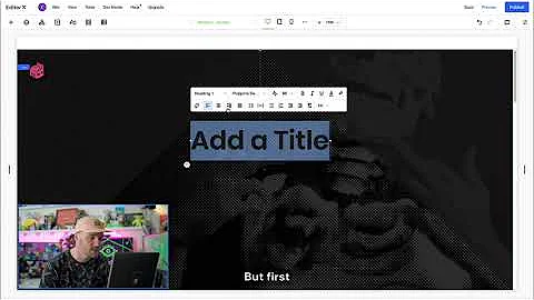
Gavin Strange explores header scroll effects | Class with | Editor X
Gavin Strange Explores Header Scroll Effects with Editor X
Hey there, design enthusiasts! It’s Gavin Strange here, welcoming you to another exciting deep-dive into the world of web design. If you've ever found yourself marveling at the sleek, captivating animations and entrance effects on top-notch websites, you're in for a treat. Today, we're going to explore one of those awe-inspiring design techniques using Editor X—header scroll effects that spice up your digital space with a cool entrance animation.
But before we dive in, remember that at NewForm, we’re all about honing your design skills and helping you carve your niche in this vast digital world. From monthly web design challenges with cash prizes to exclusive sessions with industry leaders, we have it all. So, if you're ready to elevate your design game, definitely join us at NewForm afterward for more fantastic opportunities!
Setting the Stage
Before we get into the nitty-gritty of creating stunning header scroll effects, let’s set up the foundation. I’ve started with a basic layout comprising five sections on my Editor X page. It’s crucial to have a clear structure, and since we’re all about visuals, I've added images of some of my favorite projects to keep the page engaging. Ready to create something magical? Off we go!
Minimum Height and Inspector Panel Magic
First things first, we're focusing on a blank section. Setting the minimum height to 100 viewport height (vh) ensures that the section takes up the full height of the viewer’s screen. This technique is pivotal for creating a full-screen section that’s visually impactful. And guess what? You can manage all this through the Inspector Panel, positioned smartly on the right for easy access. It’s your go-to tool for tweaking the size, position, and behavior of your elements—get ready to see me using it quite a bit!
Master Sections and Headers: Putting It All Together
Now, let's add some dynamic flair. We’ll create vertical sections on either side of our main section. How? With the simple click of a blue plus icon. As easy as pie, right? By marking these as ‘master’ sections, you make them universally applicable across multiple pages. In this case, we’re giving it a master status to facilitate snazzy transitions later. With the scroll effect set to 'fixed' and causing overlap with the next section, our left header is already exuding style. The same goes for the right—rinse and repeat, and you’ve got symmetry with panache.
Images and More: All About the Layers
Once our headers are in place, it’s time to add some imagery. The left image slides into place thanks to the drag-and-drop functionality, and I stretch it to ensure it fills the container entirely. The key to organized design? Naming your layers right away and keeping tabs on everything from the layers panel. Trust me, future-you will appreciate the neatness.
Next, let’s add geometric shapes for an artistic touch. By maneuvering the settings, we make the triangle fit snugly into the corner. Changing its color blends it seamlessly with the rest of the design. These small touches build a coherent and engaging aesthetic. We apply similar transformations to the right header, ensuring balance and harmony across the page, and again, naming them properly in the layers panel.
Bringing Text into the Spotlight
With our headers set to tease and delight, it’s time to focus on the main header. We bring it to the forefront by ensuring alignment, setting heights to match, and overlapping subsequent sections congenially. A vital aspect of any design is typography, and here, bold, big text makes its grand entrance. Adjusting font size, color, and line spacing through the Inspector Panel ensures it stands out.
Adding directive elements, like an inviting “scroll down” text, further engages users in exploring more. Incorporating decorative arrows adds clarity and style—another fabulous way to guide user interaction.
Ensuring Compatibility Across Devices
A constant concern with web design is fluidity on varying screen sizes. Using the ‘stacking’ feature, we keep elements aligned and ensure they maintain consistent spacing—regardless of the display. Adjusting vertical margins ensures everything sits pretty, making the transition from desktop to mobile seamless.
Making the Magic Happen: Transitions
With the basics in place, it’s time for the magic! By using scroll effects, we bring each header alive with movement. Setting directional transitions on the Inspector Panel—it’s as simple as setting them to move left, right, or upwards, aligning with our design vision. The beauty of web design lies in these transitions; they transform a static page into a living, breathing entity.
The difference created by these transitions is immeasurable. It prompts a sense of connectivity and depth, pulling the viewer into a cohesive narrative driven by movement and interaction.
Wrap-up and Next Steps
Phew! There you have it—a stunning entrance animation using Editor X’s header scroll effects. Not only have you added flair to your page, but you've also imbibed a nuanced storytelling approach in web design. It’s the minute details that take a project from good to unforgettable.
Feeling inspired? Dive deeper into design with NewForm—where the community is bustling with creativity. Join us for a myriad of learning opportunities, connect with industry leaders, and participate in challenges to sharpen those skills further. Don’t just stop at this tutorial; there’s a whole world of creative conquest awaiting you at NewForm. Let’s redefine what’s possible, one design at a time!
Happy Designing, and see you at NewForm!


