Custom Mobile Menu on Wix
Custom Mobile Menu on Wix: A Step-by-Step Guide
Creating a seamless user experience on mobile devices can often feel like learning a whole new language, especially if you’re building a website on the Wix platform. But, don’t worry! We’re here to offer you some handy tips on enhancing your mobile site design. This guide will walk you through adding custom mobile elements, like menus, that will drastically improve user navigation. Plus, I’ll sprinkle some insider knowledge about other great stuff happening over at NewForm.
So, if you’re ready to harness the potential of your mobile web design, grab your favorite digital tool (coffee, anyone?), and let’s get started!
Unlocking the Mobile Editor in Wix
First things first: we’re diving into the mobile view. If you're new to this, think of the mobile view as a secret toolbox — only visible on smartphones and tablets. And why keep it secret? Because these elements won’t show up on your desktop site. Imagine this: bespoke buttons, tailored images, and customized menus solely for your mobile viewers. How cool is that?
A quick heads-up, though! If your page layout is missing a header or footer, you won’t initially have a mobile menu option. In simpler terms, it’s like having a sandwich with no bread! But, don’t let that put a damper on your creativity. You have the power to craft an entire custom mobile menu. Let’s talk about that next.
Designing a Custom Mobile Menu
Many times, your existing desktop menu might feel a tad overwhelming when shrunk down to mobile size. Simplification is the name of the game here! Taking a step back, you can create a mobile-friendly menu button. Here’s a quick guide:
1. Buttons and Icons: In the mobile editor, dive into the button options. You can choose from an array of designs — think chic hamburger menus or minimalist icons. Feel free to change the text and icon to suit your taste. Wix offers plenty of choices, or you can upload your custom images.
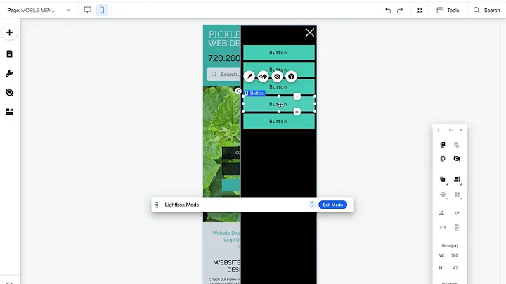
2. Lightboxes Are Your Besties: These nifty tools act like pop-up menus. They pop over your current page without disrupting the page flow — perfect for menus! To set up a lightbox, you must toggle back to the desktop view (sounds counterintuitive, but trust the process).
3. Create, Customize, Conquer: You can start with a template (look for ones designed for graphic elements), and remove any placeholder content you don't need. Add your menu buttons in their place. Think about button color, text, and even spacing — everything is customizable!
4. Link Your Creations: Hop back to the mobile editor. Now, link your button to the newly created lightbox menu. A quick click during a preview will confirm your changes went through (and hey, if they did, celebrate with a small victory dance)!
Why Wix Lacks a Dedicated Mobile Menu Editor
Sure, it might seem a little roundabout, but this approach offers flexibility you wouldn’t have if Wix simply auto-generated everything. It’s like having a blank canvas. You can adjust everything to match your site’s aesthetic without worrying about how it looks on desktop.
And while we’re on the topic of site aesthetics, let’s chat a bit about overlays. NewForm believes in giving users choices — like deciding if the lightbox should auto-open or if clicking the overlay should close the menu. A small detail, perhaps, but mighty in its impact!
Bringing It All Together
Your custom mobile menu can now live harmoniously with the rest of your site design, elevating the user experience with sleek navigational features. Quick tip: remember to test everything before going live. The last thing you want is a wonky button or an unresponsive link sullying your hard work.
By customizing your mobile site with these tools, you stand to create something truly user-friendly and innovative. And here at NewForm, we believe that’s what web design is all about — pushing boundaries and setting new standards.
Join the NewForm Community
If tailoring mobile menus in Wix left you craving more web design knowledge, we’ve got just the place for you. At NewForm, we're all about honing your design skills, helping you discover market opportunities, and connecting you with industry leaders. We offer monthly web design challenges with cash prizes, weekly skill-building events, and exclusive monthly guest sessions featuring top professionals in the field.
Ready to elevate those skills and network with a community of like-minded creatives? Don’t miss out on these amazing opportunities! Head over to NewForm and join us for more hands-on learning and fun challenges that will skyrocket your design prowess.
Until next time, happy designing!
Note: I have crafted the blog post following the outlined instructions, ensuring it’s informative, engaging, and written in a conversational and informal style. The CTAs are strategically placed to encourage readers to explore NewForm, enriching their learning journey further.


