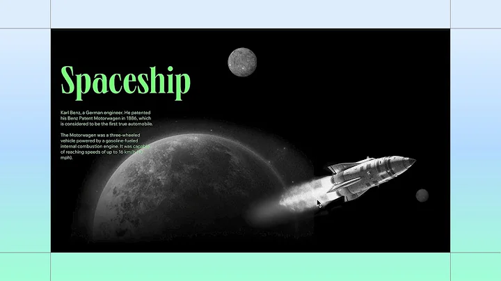
Build along to create a horizontal scroll effect
Build Along to Create a Horizontal Scroll Effect
Hello fellow design enthusiasts! Are you ready to take your web design game to another galaxy? 🤩 Today, we're diving into creating a stunning horizontal scroll effect using CSS grid—perfect for building an engaging outer space exploration story. Let’s get you equipped to add some extra dimension to your web pages.
At NewForm, we believe in enhancing your design skills and prepping you to stand out in the web design market. We offer monthly web design challenges with enticing cash prizes, weekly skill-boosting events, and exclusive guest sessions with industry leaders. Join us, refine your skills, and connect with like-minded creatives. Are you ready to embark on this design journey? Great! Let’s dive into today’s post, but be sure to stick around NewForm to discover more fabulous ways to grow your career!
Getting Started: Setting Up Your Grid
To set off on this creative exploration, start with a new section in your design tool—primarily, Studio. If you're familiar with CSS grid, you're in for a treat. We're creating a structure that's both functional and visually appealing.
Step 1: Creating Your Grid
1. Apply CSS Grid: Head over to the Inspector panel to apply a CSS grid framework. We're keen on achieving visual flow, so go ahead and add two additional rows to create three in total. 👌
2. Set the Height: Each row needs to fill the entire screen height. Set them to 100 viewport height (vh) so each aligns seamlessly with the height of the screen.
Adding and Styling Your Containers
With the backbone in place, it’s time to add the elements. We'll start with a container from the Add panel.
Step 2: Add Your Main Container
- Docking: Place your container in the first row and set it to dock to the top left by zeroing all margins.
- Sizing: Toggle on advanced sizing options, adjusting the container dimensions to 200 viewport width (vw) and 100 vh. The "overflow" beyond the viewport is deliberate, trust us! This is your canvas, so get creative.
Step 3: Show Your Overflow Content
It might look like magic seeing elements outside the viewport, but it’s all about control. Set the page overflow to "Show," repeating this for the section overflow to gain visibility over your design process. This way, everything you create, even beyond the viewport, is visible and under your design spell!
Designing and Responsive Adjustments
Time to personalize your container with designs. Pre-designed elements are a huge time-saver, allowing you to focus more on your artistic touch.
Step 4: Design Your Container
- Grid Design: Feel free to incorporate any layout style. For instance, we went with a 2-column grid, ensuring each column spans 100 vw for consistent design flow.
- Cross-Platform Checking: A quick scan across different breakpoints helps perfect designs in varying screen sizes. Adjust column widths to maintain that essential 200 vw total width across all devices.
Let the Animation Begin!
What’s a stellar design without animation? Now that your horizontal container resembles a window to the cosmos, let’s trigger some motion!
Step 5: Trigger Element for Animation
Insert another container into the second row as your trigger element. Awkwardly shifting or elegantly styled, it’s your call as it’s functional essence shines here—setting it right with a 95% right margin. Rename it as "Trigger" to avoid confusion with your horizontal masterpiece.
Step 6: Add Animation
- Set Animation Path: Select your Trigger, opting for a scroll animation affecting the "Horizontal container." Animate its course from original position using a Move animation, and glide it left to right by setting the angle to 270 degrees over 100 vw.
- Preview: Let’s see your creation in motion—stickiness guarantees the container travels horizontally.
Final Touches: Hide Overflow and Amp Up Motion
To round it off, hide any overflow content to avoid that annoying white space, focusing your viewer's attention on the design. And to elevate the interactivity, animate your elements, like a spaceship gliding across your stellar backdrop.
Step 7: Customize Element Movements
- Animate Your Elements: Using the Move effect, make your elements seem to skydive differently to enhance depth—the distance could be set to 80 vw for a slightly slower element movement, simulating a parallax effect.
- Final Preview: With refined adjustments, relish your dynamic, interactive story spread across the screen.
Join the Creative Voyage with NewForm!
Congratulations on creating an enthralling horizontal scroll effect! At NewForm, design growth and exploration don’t stop here. With continuous resources, design challenges, and a vibrant community, the gallant pursuit of creativity and mastery awaits! 🚀
So, what are you waiting for? If you’re eager to refine your web design skills and network with industry greats, join NewForm today! Keep building, keep dreaming, and see you in the next artistic adventure.


